
Assessment Score Reports Must Get Better!

A few simple places to start
“Score reports are the main way that we communicate with the public about our tests, but they are the last thing we attend to in the test design.”
That’s what the late Ron Hambleton, one of the great measurement experts and a dear friend of ours here at the Center, used to remind us. As Carla Evans and I wrote in Understanding Instructionally Useful Assessment, individual student score reports are essential factors in promoting or hindering the instructional usefulness of test results.
We need to do a much better job with our aggregate (school, district, and state) reports. This has become clear to me as I’ve participated in many technical advisory committee meetings over the years. I have two suggestions: item maps and percentile displays. These are two relatively straightforward presentations that can help every state and large district make a difference almost immediately.
Making Assessment Information Easy and Quick to Grasp
Item maps help illustrate what students know and can do in tested subject areas by positioning descriptions of individual assessment items along the test scale at each grade level. An item is placed at the point on the scale where students are more likely to respond successfully. The figure below displays an excerpt from the 2022 Grade 4 National Assessment of Educational Progress (NAEP) item map.
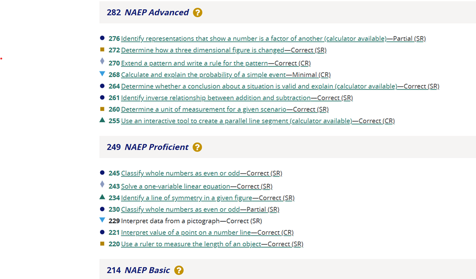
When writing the state’s content standards and achievement level descriptors to describe various levels of performance, context experts try to make these as clear as possible for teachers and students. However, there’s nothing like seeing actual test items to crystallize the intended learning expectations.
Various assessment programs have issued released-item reports. For example, Massachusetts used to release all of the test questions that counted in students’ scores each year. These released-item reports show how students performed on each released item. It’s a great tool to help educators understand how their students performed on specific skills and knowledge found on their state assessment.
But released-score reports carry a price tag. Test items are very expensive to develop—$3,000-$20,000 per item, depending on the type of item—so releasing enough to make a released-item report useful is very expensive. Further, some experts worried that teachers might require students to practice the released items instead of recognizing that the items were meant to represent skills and knowledge found in the content standards.
Item maps are the next best thing, and in many ways, they might be better than released-item reports because they explicitly connect student performance on items with the test scale and avoid the risk of excessive practice. They are also relatively cost-effective because they make releasing new items each year unnecessary.
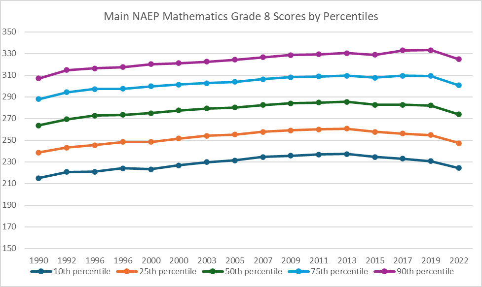
Percentile Displays Illuminate Trends
I’ve been privileged to serve on the National Assessment Governing Board (NAGB) as one of the three measurement professionals since 2021. NAGB is the congressionally mandated board responsible for setting policies for the National Assessment of Educational Progress (NAEP). I had previous experience with item maps (also called Wright Maps, after the noted psychometrician Ben Wright), but I had not seen the types of percentile displays used in NAEP reporting until I joined NAGB.
Percentile displays, shown below, are a powerful way to portray the trends in performance for students scoring at various levels along the score distribution. The chart below shows that the gap between the highest (90th percentile) and lowest (10th percentile) performing 8th grade students increased by about 9 points between 1990 and 2022.
Keep in mind that we were rightfully wringing our collective hands when average scores dropped 8 points between 2019 and 2022. Yet, this sort of display makes it brutally clear that the approximate 100-point gap between the 10th and 90th percentile students indicates that our lowest-scoring students are being underserved, and it’s getting worse. I would like to see all states employ this type of report. Maybe it would serve as a call to action.
More Help for Report Users
Yes, I said I had two relatively easy recommendations, but I can’t help it; I have a few additional requests.
Score reporting has undoubtedly improved over the last 20 years, but we still have a long way to go to make it understandable and actionable for each intended user group: parents, teachers, principals, district leaders, and state policy leaders. Score reports are often designed by measurement experts who try to pack in as much information as possible. Bringing teachers and other users into the report-design process would help (as Chris Domaleski described here), but there are ways to do even better.
Few of us measurement geeks are communications professionals. For example, we’d bristle if public relations people thought they should weigh in on assessment design. We need more humility when it comes to score reporting. I urge state leaders and others responsible for assessment reporting to involve communications experts in the report-design process. I’d argue that they should even lead the design process, along with assessment and content experts. This boosts the chance that score reporting systems would be designed with users in mind.
No matter how well we design reports, we still ask users to engage in complex interpretive work. We need to provide more interpretive support. I’m optimistic about the potential for artificial intelligence (AI) applications to help with this. We already have some of the newer reporting systems offering “default” interpretations based on the data in the report instead of just presenting teachers with tables of numbers, even with some nice graphics. The rapid advances in AI, especially generative AI, offer considerable promise for enhancing the interpretability of score reports.
I plan to continue exploring advances in score reporting in the coming years. Still, for now, I encourage all large-scale assessment programs to incorporate item maps and percentile displays into their reporting systems.